WSL2 で GnuPlot を使って極座標を表示する [徒然日記]
シミュレーションデータのグラフ化にエクセルを使おうと思ったのですが、せっかくならシミュレーションプログラムを作っている WSL2 の環境から Gnuplot を直接呼べるようにしました。
手順は次の5ステップです。
VcXsrvのインストール、起動方法はこちらのサイトがわかりやすいです。
次のようなデータファイルを"beam.dat"を用意します。
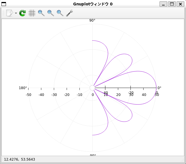
このデータを極座標で表示するために、次の GnuPlot のスクリプトファイル”polor.gnuplot”を用意しました。
このスクリプトは次の手順で表示できます。
こちらが表示したグラフです。極座標のグラフが表示できました。^^
手順は次の5ステップです。
【STEP1】 WSL2 (Ubunt 22.04.2 TLS) をMicrosoft Storeからインストール
【STEP2】 VcXsrv Windows X Server をインストール
【STEP3】 スタートメニューから「XLaunch」を選択して起動 ※"Disable access control"をチェック
【STEP4】 WSL2 のターミナルを開いて、gnuplot をインストール ※ sudo apt install gnuplot
【STEP5】 WSL2 のターミナル上で gnuplot を起動してデータをグラフ化
VcXsrvのインストール、起動方法はこちらのサイトがわかりやすいです。
次のようなデータファイルを"beam.dat"を用意します。
-90.000000 -13.006601
-89.639279 -13.007419
-89.278557 -13.009873
-88.917836 -13.013969
-88.557114 -13.019712
-88.196393 -13.027112
-87.835671 -13.036182
-87.474950 -13.046937
-87.114228 -13.059395
....
89.639279 -13.007419
90.000000 -13.006601
このデータを極座標で表示するために、次の GnuPlot のスクリプトファイル”polor.gnuplot”を用意しました。
reset
set angles degrees
set polar
set grid polar 30 lc rgbcolor "#999999"
unset border
unset param
set size ratio 1 1,1
set xtics axis nomirror -50,10
unset ytics
unset key
set style data line
set xrange[-50:50]
set yrange[-50:50]
set rrange[-50:0]
set label 1 "0°" at graph 1.01,0.5 front
set label 2 "180°" at graph -0.01,0.5 right front
set label 3 "-90°" at graph 0.5,-0.03 center front
set label 4 "90°" at graph 0.5,1.03 center front
plot 'beam.dat'
このスクリプトは次の手順で表示できます。
$ gnuplot
gnuplot> call 'polor.gnuplot'
こちらが表示したグラフです。極座標のグラフが表示できました。^^
- 作者: 大竹 敢
- 出版社/メーカー: テクノプレス
- 発売日: 2023/03/13
- メディア: 単行本

ys_taro さん

-
nice! 35196
記事 1099
テーマ 趣味・カルチャー
プロフィール
Contact Me


